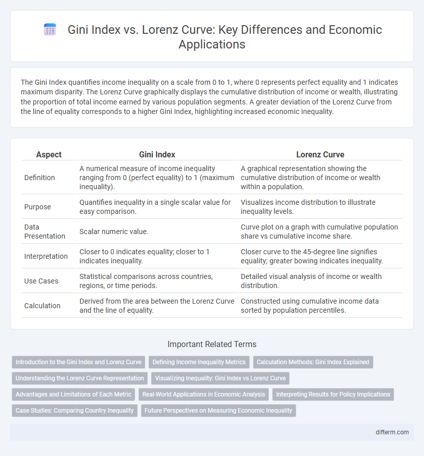
The Gini Index quantifies income inequality on a scale from 0 to 1, where 0 represents perfect equality and 1 indicates maximum disparity. The Lorenz Curve graphically displays the cumulative distribution of income or wealth, illustrating the proportion of total income earned by various population segments. A greater deviation of the Lorenz Curve from the line of equality corresponds to a higher Gini Index, highlighting increased economic inequality.
Table of Comparison
| Aspect | Gini Index | Lorenz Curve |
|---|---|---|
| Definition | A numerical measure of income inequality ranging from 0 (perfect equality) to 1 (maximum inequality). | A graphical representation showing the cumulative distribution of income or wealth within a population. |
| Purpose | Quantifies inequality in a single scalar value for easy comparison. | Visualizes income distribution to illustrate inequality levels. |
| Data Presentation | Scalar numeric value. | Curve plot on a graph with cumulative population share vs cumulative income share. |
| Interpretation | Closer to 0 indicates equality; closer to 1 indicates inequality. | Closer curve to the 45-degree line signifies equality; greater bowing indicates inequality. |
| Use Cases | Statistical comparisons across countries, regions, or time periods. | Detailed visual analysis of income or wealth distribution. |
| Calculation | Derived from the area between the Lorenz Curve and the line of equality. | Constructed using cumulative income data sorted by population percentiles. |
Introduction to the Gini Index and Lorenz Curve
The Gini Index is a statistical measure that quantifies income inequality within a population, ranging from 0 (perfect equality) to 1 (maximum inequality). The Lorenz Curve graphically represents the distribution of income by plotting the cumulative percentage of total income earned against the cumulative percentage of the population. Together, these tools provide essential insights into economic disparities and are fundamental in assessing wealth distribution across societies.
Defining Income Inequality Metrics
The Gini Index quantifies income inequality by measuring the deviation of the Lorenz Curve from perfect equality, expressed as a value between 0 and 1, where 0 represents complete equality and 1 indicates maximal inequality. The Lorenz Curve graphically depicts the cumulative share of income earned by cumulative percentages of the population, illustrating the distribution of wealth across a society. Together, these metrics provide complementary insights, with the Lorenz Curve offering a visual representation and the Gini Index supplying a single summary statistic for income disparity analysis.
Calculation Methods: Gini Index Explained
The Gini Index is calculated by measuring the area between the Lorenz Curve and the line of perfect equality, then dividing it by the total area under the line of perfect equality. This index ranges from 0 to 1, where 0 represents perfect income equality and 1 indicates maximal inequality. The calculation involves integrating the Lorenz Curve and using the formula G = A / (A + B), where A is the area between the equality line and Lorenz Curve, and B is the area under the Lorenz Curve.
Understanding the Lorenz Curve Representation
The Lorenz Curve graphically represents income distribution by plotting the cumulative percentage of total income earned against the cumulative percentage of the population, starting from the poorest to the richest. It visually demonstrates the degree of inequality, with a perfectly equal income distribution represented by a 45-degree line, while greater deviations indicate higher inequality levels. The Gini Index quantifies this inequality by measuring the area between the Lorenz Curve and the line of equality, providing a numerical value to assess economic disparity.
Visualizing Inequality: Gini Index vs Lorenz Curve
The Lorenz Curve graphically represents income or wealth distribution by plotting the cumulative percentage of total income earned against the cumulative percentage of the population, highlighting inequality visually. The Gini Index quantifies this inequality, calculated as twice the area between the Lorenz Curve and the line of perfect equality, providing a numerical value between 0 and 1 where higher values indicate greater inequality. Together, the Lorenz Curve and Gini Index offer complementary tools for analyzing economic disparities within a country or region.
Advantages and Limitations of Each Metric
The Gini Index quantifies income inequality on a scale from 0 to 1, offering a clear, single-value metric that simplifies comparison across countries and time periods but lacks detail on distribution specifics within populations. The Lorenz Curve graphically represents income distribution, providing a visual understanding of inequality patterns and the proportion of total income held by segments of the population, yet its interpretation can be subjective and less straightforward for statistical analysis. While the Gini Index is efficient for policy benchmarking, the Lorenz Curve excels in illustrating the depth and nuance of inequality, though neither metric alone captures multidimensional aspects of economic disparity.
Real-World Applications in Economic Analysis
The Gini Index quantifies income inequality by measuring the area between the Lorenz Curve and the line of perfect equality, providing a single numerical value for economic disparity. Economists employ the Lorenz Curve to visually assess wealth distribution within a population, highlighting segments where inequality is most pronounced. Real-world applications include policy evaluation, poverty measurement, and assessing the impact of fiscal interventions on reducing income inequality across countries and regions.
Interpreting Results for Policy Implications
The Gini Index quantifies income inequality on a scale from 0 to 1, where higher values indicate greater disparity, guiding policymakers in assessing the severity of economic inequality. The Lorenz Curve visually represents income distribution, highlighting the proportion of total income earned by cumulative population segments, aiding in identifying which groups are most disadvantaged. Interpreting both tools together allows for targeted policy interventions, such as progressive taxation or social welfare programs, aimed at reducing inequality and promoting inclusive economic growth.
Case Studies: Comparing Country Inequality
Case studies comparing country inequality reveal that the Gini Index quantifies inequality on a scale from 0 to 1, with higher values indicating greater income disparity, while the Lorenz Curve visually represents income distribution by plotting the cumulative share of income against the cumulative share of the population. For example, South Africa exhibits one of the highest Gini coefficients globally, reflecting severe inequality illustrated by a Lorenz Curve bowed far from the line of perfect equality, whereas countries like Denmark show low Gini Index values and Lorenz Curves close to the equality line, indicating more equitable income distribution. These measures complement each other, providing both numeric precision and graphical insight into the economic disparities within and across nations.
Future Perspectives on Measuring Economic Inequality
Emerging methodologies integrating machine learning with traditional Gini Index and Lorenz Curve analyses offer more dynamic insights into economic inequality trends. Enhanced data visualization tools are poised to improve policymakers' ability to interpret regional disparities and implement targeted interventions. Future research emphasizes real-time inequality monitoring using big data, potentially revolutionizing socioeconomic planning and resource allocation.
Gini Index vs Lorenz Curve Infographic