Flat UI emphasizes minimalistic, two-dimensional elements with bold colors and simple typography to create a clean and straightforward user experience. Material Design builds on flat principles by incorporating depth, shadows, and motion to simulate real-world tactile interactions and enhance usability. Choosing between Flat UI and Material Design depends on the desired balance between simplicity and interactive richness in technology interfaces.
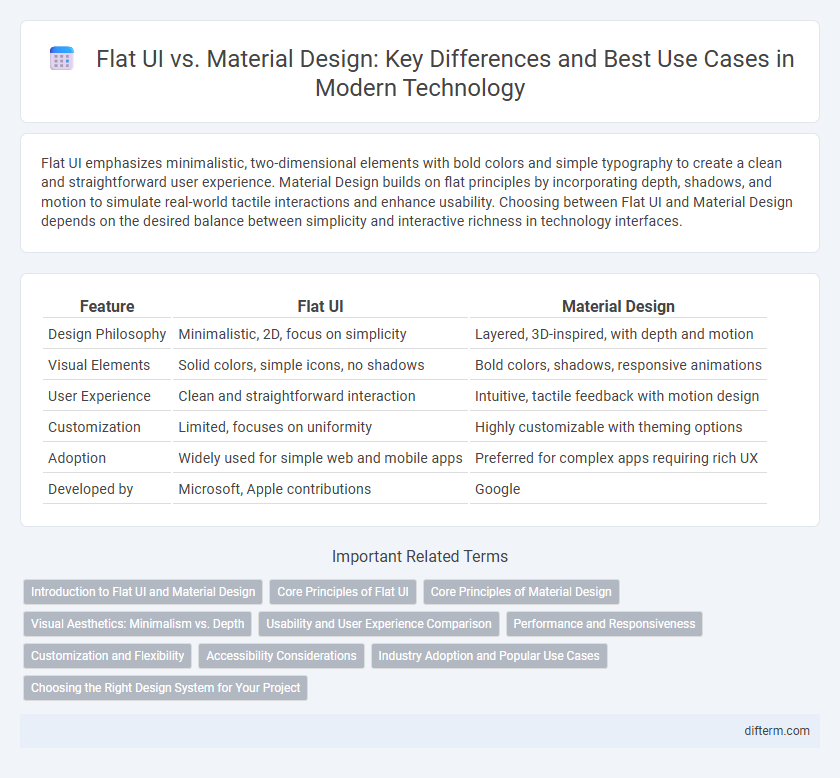
Table of Comparison
| Feature | Flat UI | Material Design |
|---|---|---|
| Design Philosophy | Minimalistic, 2D, focus on simplicity | Layered, 3D-inspired, with depth and motion |
| Visual Elements | Solid colors, simple icons, no shadows | Bold colors, shadows, responsive animations |
| User Experience | Clean and straightforward interaction | Intuitive, tactile feedback with motion design |
| Customization | Limited, focuses on uniformity | Highly customizable with theming options |
| Adoption | Widely used for simple web and mobile apps | Preferred for complex apps requiring rich UX |
| Developed by | Microsoft, Apple contributions |
Introduction to Flat UI and Material Design
Flat UI emphasizes minimalistic design with simple elements, bold colors, and clean typography, enhancing usability through clarity and straightforward visuals. Material Design, developed by Google, introduces a tactile reality with layered surfaces, shadows, and animations to create a sense of depth and interactive feedback. Both design philosophies aim to improve user experience but differ in complexity, visual hierarchy, and interaction cues.
Core Principles of Flat UI
Flat UI emphasizes simplicity, minimalism, and a focus on usability by using clean, two-dimensional elements without gradients, shadows, or textures. The core principles include bold colors, crisp typography, and clear iconography to enhance visual hierarchy and user interaction. This design approach prioritizes speed and responsiveness, ensuring intuitive navigation and fast loading times across digital platforms.
Core Principles of Material Design
Material Design emphasizes tactile surfaces, bold colors, and purposeful animations to create intuitive user experiences. It incorporates depth effects such as shadows and lighting to provide real-world metaphors that guide user interaction. Core principles include a layered interface with responsive transitions, consistent grid-based layouts, and adaptive design for various devices.
Visual Aesthetics: Minimalism vs. Depth
Flat UI emphasizes minimalism with simple shapes, bold colors, and clean typography to create a visually straightforward interface that enhances usability. Material Design incorporates depth through shadows, layering, and motion effects, providing a tactile experience that mimics real-world surfaces. These contrasting approaches influence user engagement by balancing clarity and interactive richness in digital product design.
Usability and User Experience Comparison
Flat UI emphasizes simplicity with minimalistic elements and bold colors, enhancing user focus and reducing cognitive load for faster navigation. Material Design integrates depth, shadows, and animations to create a more tactile and intuitive interface, improving user engagement and providing clear visual hierarchy. Usability tests show Material Design often results in higher user satisfaction due to its interactive feedback, while Flat UI excels in speed and straightforward task completion.
Performance and Responsiveness
Flat UI prioritizes simplicity and minimalistic elements, resulting in faster load times and improved performance due to fewer graphic resources. Material Design incorporates depth, shadows, and animations, which can enhance user experience but may demand more processing power and affect responsiveness on lower-end devices. Choosing Flat UI benefits applications requiring optimal speed and responsiveness, while Material Design suits projects emphasizing rich, tactile interactions.
Customization and Flexibility
Flat UI offers straightforward customization with simple color schemes and minimalistic elements, allowing designers to quickly adapt interfaces but often limiting advanced flexibility. Material Design provides robust customization options through dynamic components, shadows, and responsive animations, enabling more detailed and flexible user experiences. Developers leveraging Material Design benefit from extensive guidelines and adaptable elements that support diverse device responsiveness and user interaction patterns.
Accessibility Considerations
Flat UI emphasizes simplicity and minimalism, often using high-contrast colors and clear typography to enhance readability for users with visual impairments. Material Design incorporates layered elements and shadow effects, which can improve spatial understanding but may pose challenges for screen readers if not properly coded. Both designs must adhere to WCAG guidelines to ensure sufficient color contrast, keyboard navigability, and semantic HTML for optimal accessibility.
Industry Adoption and Popular Use Cases
Material Design, developed by Google, has gained widespread industry adoption due to its comprehensive guidelines and emphasis on depth, motion, and grid-based layouts, making it popular in mobile app development and enterprise software. Flat UI, prized for its simplicity and minimalism, remains dominant in web design and dashboards where fast load times and straightforward user interfaces are critical. Major companies like Google and Microsoft prefer Material Design for consistency across platforms, while startups and agencies often choose Flat UI to enhance speed and ease of customization.
Choosing the Right Design System for Your Project
Flat UI emphasizes simplicity with minimalistic elements and a focus on typography, making it ideal for projects needing fast load times and straightforward user interactions. Material Design incorporates depth, shadows, and motion, enhancing visual hierarchy and user guidance for complex, interactive applications. Selecting the right design system depends on project requirements such as user experience goals, development resources, and platform consistency.
Flat UI vs Material Design Infographic