 difterm.com
 Responsive web design uses flexible grids and media queries to create a fluid layout that adjusts seamlessly across all screen sizes, ensuring consistent user experience. Adaptive web design relies on multiple fixed layouts tailored to specific devices or screen widths, delivering optimized interfaces but less flexibility for unexpected screen sizes. Prioritizing responsiveness enhances accessibility and future-proofs websites for emerging devices.
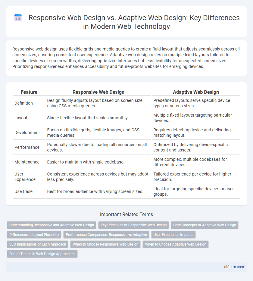
Table of Comparison
| Feature | Responsive Web Design | Adaptive Web Design |
|---|---|---|
| Definition | Design fluidly adjusts layout based on screen size using CSS media queries. | Predefined layouts serve specific device types or screen sizes. |
| Layout | Single flexible layout that scales smoothly. | Multiple fixed layouts targeting particular devices. |
| Development | Focus on flexible grids, flexible images, and CSS media queries. | Requires detecting device and delivering matching layout. |
| Performance | Potentially slower due to loading all resources on all devices. | Optimized by delivering device-specific content and assets. |
| Maintenance | Easier to maintain with single codebase. | More complex, multiple codebases for different devices. |
| User Experience | Consistent experience across devices but may adapt less precisely. | Tailored experience per device for higher precision. |
| Use Case | Best for broad audience with varying screen sizes. | Ideal for targeting specific devices or user groups. |
Understanding Responsive and Adaptive Web Design
Responsive web design uses fluid grids and flexible images to ensure websites automatically resize and reflow content across various devices, providing consistent user experiences. Adaptive web design employs multiple fixed layouts tailored to specific screen sizes, loading the most appropriate version based on the device's detected capabilities. Both strategies aim to optimize usability and performance, but responsive design prioritizes seamless scalability while adaptive design focuses on device-targeted precision.
Key Principles of Responsive Web Design
Responsive web design employs fluid grids, flexible images, and CSS media queries to create web pages that seamlessly adjust to varying screen sizes and resolutions. It prioritizes a mobile-first approach, ensuring usability and accessibility across all devices by dynamically adapting content layout in real time. The core principle involves designing a single, flexible interface that fluidly responds to the user's environment without requiring multiple fixed layouts.
Core Concepts of Adaptive Web Design
Adaptive web design relies on creating multiple fixed layout sizes tailored to specific device types, enabling the website to detect the user's device and serve the appropriate version. This core concept emphasizes predefined templates for desktops, tablets, and smartphones, optimizing performance and user experience by delivering device-specific content and interface elements. By using server-side detection and dynamic loading, adaptive design ensures faster load times and precise control over design presentation across diverse devices.
Differences in Layout Flexibility
Responsive web design uses fluid grids and flexible images to automatically adjust the layout based on the screen size, ensuring seamless usability across diverse devices. Adaptive web design employs predefined fixed layouts tailored to specific screen sizes, delivering optimized experiences for a set range of devices but lacking the fluidity of responsive layouts. This distinction in layout flexibility impacts performance, user experience, and design complexity, with responsive designs offering greater adaptability and adaptive designs providing targeted control.
Performance Comparison: Responsive vs Adaptive
Responsive web design uses a fluid grid layout that adjusts seamlessly to different screen sizes, prioritizing consistent user experience with moderate performance impact due to flexible image scaling and CSS3 media queries. Adaptive web design detects specific device types and loads predefined layouts tailored for each, often resulting in faster load times and improved performance by delivering device-optimized assets and minimizing unnecessary content. Performance comparison shows adaptive design typically outperforms responsive in load speed and resource efficiency, though responsive offers greater flexibility across diverse devices without manual customization.
User Experience Impacts
Responsive web design enhances user experience by providing a fluid layout that adjusts seamlessly to any screen size, ensuring consistent accessibility across devices. Adaptive web design improves performance and usability by delivering tailored layouts optimized for specific devices, reducing load times and enhancing interaction. Both approaches prioritize user engagement but differ in flexibility and customization, impacting how users perceive and interact with digital content.
SEO Implications of Each Approach
Responsive web design enhances SEO by providing a single URL and consistent HTML across devices, improving crawl efficiency and reducing duplicate content issues. Adaptive web design may require multiple URLs or dynamic serving, potentially complicating indexing and increasing the risk of duplicate content penalties. Prioritizing responsive design boosts site speed and mobile usability metrics, key factors in Google's ranking algorithms.
When to Choose Responsive Web Design
Responsive web design is ideal for projects requiring fluid layouts that seamlessly adjust across all device sizes, ensuring consistent user experience without separate codebases. It excels in SEO performance due to unified URLs and easier maintenance, reducing development time and cost. Businesses prioritizing scalability and future-proof design should opt for responsive web design to accommodate evolving screen dimensions and technologies.
When to Choose Adaptive Web Design
Adaptive web design is ideal when targeting specific devices or screen sizes to deliver highly customized user experiences. It uses distinct layouts configured for various resolutions, improving performance on known devices by loading only necessary resources. Choose adaptive design for applications requiring precise control over UI elements and load efficiency across multiple platforms.
Future Trends in Web Design Approaches
Responsive web design uses fluid grids and flexible images to create websites that seamlessly adjust to any screen size, ensuring optimal user experience across devices. Adaptive web design relies on distinct layouts tailored for specific devices or screen widths, enhancing performance by serving pre-designed templates. Future trends emphasize hybrid models combining responsiveness and adaptiveness with AI-driven personalization to deliver faster, more intuitive, and user-centric web experiences.
Responsive web design vs Adaptive web design Infographic