 difterm.com
 Responsive design fluidly adjusts a pet technology interface to fit any screen size using flexible grids and images, ensuring seamless user experience across devices. Adaptive design employs multiple fixed layouts tailored to specific screen dimensions, optimizing performance by delivering predetermined content variations. Choosing between responsive and adaptive design depends on the need for flexibility versus customization in pet tech applications.
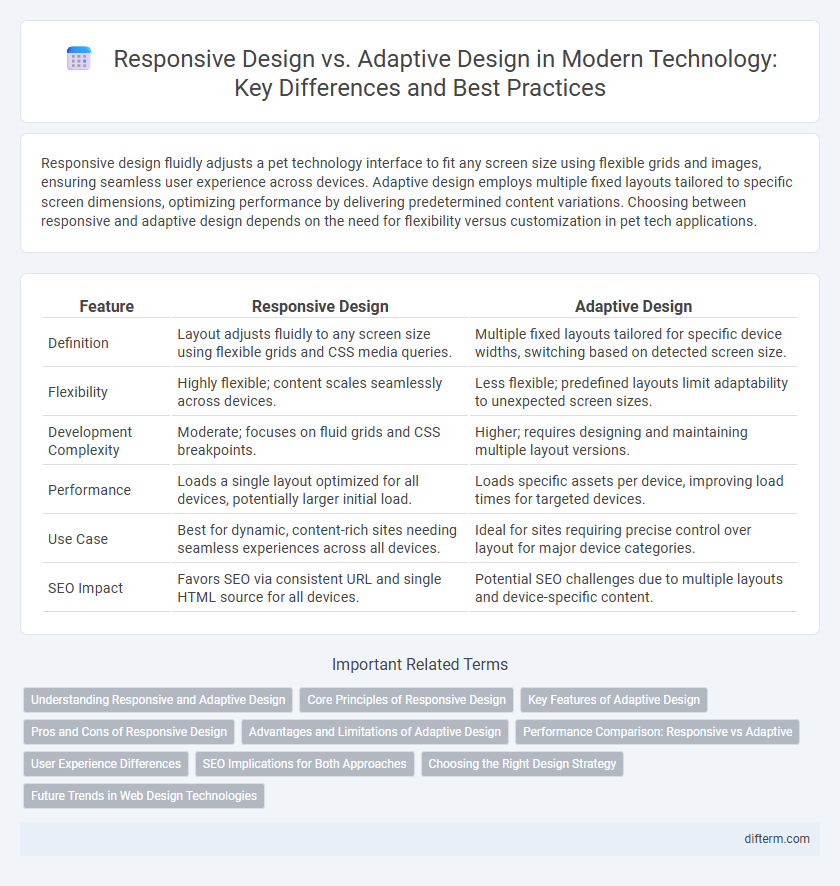
Table of Comparison
| Feature | Responsive Design | Adaptive Design |
|---|---|---|
| Definition | Layout adjusts fluidly to any screen size using flexible grids and CSS media queries. | Multiple fixed layouts tailored for specific device widths, switching based on detected screen size. |
| Flexibility | Highly flexible; content scales seamlessly across devices. | Less flexible; predefined layouts limit adaptability to unexpected screen sizes. |
| Development Complexity | Moderate; focuses on fluid grids and CSS breakpoints. | Higher; requires designing and maintaining multiple layout versions. |
| Performance | Loads a single layout optimized for all devices, potentially larger initial load. | Loads specific assets per device, improving load times for targeted devices. |
| Use Case | Best for dynamic, content-rich sites needing seamless experiences across all devices. | Ideal for sites requiring precise control over layout for major device categories. |
| SEO Impact | Favors SEO via consistent URL and single HTML source for all devices. | Potential SEO challenges due to multiple layouts and device-specific content. |
Understanding Responsive and Adaptive Design
Responsive design employs fluid grids and flexible images to create layouts that automatically adjust to different screen sizes, enhancing user experience across devices. Adaptive design uses predefined static layouts tailored to specific screen widths, allowing precise control over the design for various devices. Understanding the distinctions between these approaches helps optimize website performance and usability in technology development.
Core Principles of Responsive Design
Responsive design relies on fluid grids, flexible images, and CSS media queries to create layouts that automatically adjust across a wide range of devices and screen sizes. It emphasizes seamless user experience by proportionally resizing content rather than creating fixed layouts, ensuring consistency and accessibility. Core principles include scalability, flexibility, and mobile-first development to enhance performance and usability.
Key Features of Adaptive Design
Adaptive design uses multiple fixed layout sizes tailored to specific devices, enhancing user experience by delivering optimized views for different screen resolutions. It relies on device detection and server-side user-agent analysis to serve the appropriate layout, ensuring faster load times and improved performance. Key adaptive design features include multiple distinct templates, device-specific customization, and precise control over content presentation across smartphones, tablets, and desktops.
Pros and Cons of Responsive Design
Responsive design offers seamless user experience across devices by using flexible grids and fluid layouts that automatically adjust to screen sizes, enhancing accessibility and SEO performance. However, it can lead to slower load times on complex websites due to the need to download all resources regardless of device, impacting performance on mobile networks. Maintenance is simplified compared to adaptive design since a single codebase adapts to all devices, but responsiveness may sacrifice optimized visuals tailored for specific screen dimensions.
Advantages and Limitations of Adaptive Design
Adaptive design offers enhanced user experience by delivering tailored layouts based on specific device characteristics, improving load times and performance. It excels in handling diverse screen sizes with custom breakpoints, ensuring precise control over content presentation and functionality. Limitations include increased development complexity and maintenance costs due to multiple fixed layouts, which can reduce flexibility for future device variations.
Performance Comparison: Responsive vs Adaptive
Responsive design uses flexible grids and CSS media queries to adjust layouts fluidly across devices, enhancing load speed by minimizing resource requests. Adaptive design relies on predefined layouts for specific screen sizes, which can optimize performance by serving only necessary assets but may increase initial server load due to multiple versions. Performance comparison shows responsive design excels in seamless scalability and reduced maintenance overhead, while adaptive design often delivers faster load times for targeted devices by tailoring content specifically.
User Experience Differences
Responsive design fluidly adjusts layouts based on screen size using flexible grids and images, ensuring consistent user experience across devices. Adaptive design relies on predefined layouts tailored for specific screen resolutions, optimizing performance and usability by delivering device-specific content. Users often perceive responsive design as seamless and intuitive, while adaptive design offers faster load times and customized interface elements for enhanced interaction.
SEO Implications for Both Approaches
Responsive design uses fluid grids and flexible images to adjust seamlessly across all devices, enhancing user experience and improving SEO by reducing bounce rates and increasing mobile usability metrics. Adaptive design targets specific device widths with predefined layouts, enabling precise control over performance optimization but potentially splitting content indexing and affecting search rankings if not implemented correctly. Both approaches require careful management of site speed, mobile-friendliness, and crawlability to maximize organic search visibility and ensure alignment with Google's mobile-first indexing criteria.
Choosing the Right Design Strategy
Choosing the right design strategy depends on project requirements, target audience, and device diversity. Responsive design uses flexible grids and media queries to ensure a seamless experience across all screen sizes, ideal for fluid layouts and devices with varying screen dimensions. Adaptive design delivers tailored layouts for specific device categories, providing optimized performance and user experience but requires more maintenance for multiple breakpoints.
Future Trends in Web Design Technologies
Responsive design enhances user experience by using flexible grids and CSS media queries to create layouts that seamlessly adjust to any screen size. Adaptive design employs multiple fixed layouts tailored for specific devices, offering faster loading times and customized interfaces. Future trends emphasize combining AI-driven personalization with responsive frameworks to deliver dynamic, device-optimized content that anticipates user behavior and preferences.
Responsive design vs Adaptive design Infographic