Run charts display data trends over time by plotting individual data points sequentially, allowing educators to identify patterns and shifts in student performance quickly. Control charts add upper and lower control limits to the run chart, helping to distinguish between normal variation and significant changes in educational processes. Using control charts in educational data analytics enhances the ability to make data-driven decisions by signaling when interventions are needed to improve learning outcomes.
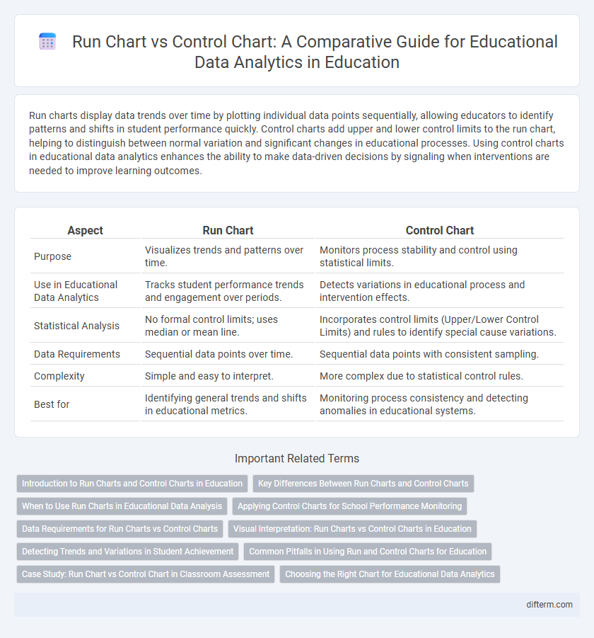
Table of Comparison
| Aspect | Run Chart | Control Chart |
|---|---|---|
| Purpose | Visualizes trends and patterns over time. | Monitors process stability and control using statistical limits. |
| Use in Educational Data Analytics | Tracks student performance trends and engagement over periods. | Detects variations in educational process and intervention effects. |
| Statistical Analysis | No formal control limits; uses median or mean line. | Incorporates control limits (Upper/Lower Control Limits) and rules to identify special cause variations. |
| Data Requirements | Sequential data points over time. | Sequential data points with consistent sampling. |
| Complexity | Simple and easy to interpret. | More complex due to statistical control rules. |
| Best for | Identifying general trends and shifts in educational metrics. | Monitoring process consistency and detecting anomalies in educational systems. |
Introduction to Run Charts and Control Charts in Education
Run charts in educational data analytics display student performance trends over time, helping identify shifts or patterns in test scores and attendance rates. Control charts extend this analysis by incorporating statistical control limits to distinguish between common cause variation and special cause variation in classroom or school-wide data. Combining run and control charts enables educators to monitor, evaluate, and improve instructional strategies based on data-driven insights.
Key Differences Between Run Charts and Control Charts
Run charts display data points over time to identify trends and shifts in educational performance, using a simple line graph without control limits, making them ideal for quick visual analysis. Control charts incorporate statistical control limits based on process variation, distinguishing between common cause and special cause variations in educational data, which aids in determining if changes are statistically significant. The presence of upper and lower control limits in control charts enhances decision-making by signaling when an educational process is out of control, unlike run charts that only highlight patterns or trends.
When to Use Run Charts in Educational Data Analysis
Run charts are ideal for monitoring student performance trends over time in educational data analysis, providing a simple visualization of data points without requiring strict control limits. They help educators identify patterns, shifts, or cycles in test scores, attendance rates, or behavioral metrics, enabling timely interventions. Use run charts when the goal is to track changes sequentially without the complexity of statistical control thresholds inherent in control charts.
Applying Control Charts for School Performance Monitoring
Control charts provide a powerful tool for monitoring school performance by visualizing variations in key educational metrics such as student test scores, attendance rates, and graduation percentages over time. Unlike run charts, control charts incorporate statistical control limits that help educators distinguish between common cause variations and special cause variations, enabling timely interventions. Applying control charts in educational data analytics enhances decision-making by highlighting trends, shifts, or outliers in school performance, facilitating continuous improvement efforts.
Data Requirements for Run Charts vs Control Charts
Run charts require fewer data points, typically a minimum of 10 to 20 sequential measurements, making them suitable for initial monitoring of educational processes or student performance trends. Control charts demand more rigorous data requirements, including a larger sample size and consistent data collection intervals, to accurately assess process stability and detect special cause variations in educational assessments. The higher data volume and statistical rigor in control charts provide more precise insights into variability in educational metrics compared to the simpler visual trends identified by run charts.
Visual Interpretation: Run Charts vs Control Charts in Education
Run charts display data trends over time, highlighting shifts, cycles, or patterns in student performance, allowing educators to easily identify variations without complex statistical analysis. Control charts incorporate statistical control limits, enabling precise detection of special cause variations in educational processes such as test score improvements or attendance rates. Visual interpretation of run charts suits preliminary data monitoring, while control charts provide rigorous insights for sustained instructional improvements and quality assurance in education.
Detecting Trends and Variations in Student Achievement
Run charts track student achievement data over time using simple plotting to detect trends and shifts in performance. Control charts add statistical control limits to distinguish between common variations and significant changes, enabling educators to identify when interventions impact learning outcomes. Combining these tools enhances the ability to monitor, analyze, and improve educational processes effectively.
Common Pitfalls in Using Run and Control Charts for Education
Run charts in education often suffer from misinterpretation due to ignoring natural data variability, leading to false conclusions about trends or shifts in student performance. Control charts require accurate control limits and stable processes; misapplying them to non-stationary educational data or small sample sizes can result in misleading signals of special cause variation. Educators must ensure proper data collection, validate assumptions, and understand each chart's specific analytical purpose to avoid common pitfalls in educational data analytics.
Case Study: Run Chart vs Control Chart in Classroom Assessment
The case study comparing run charts and control charts in classroom assessment highlights key differences in monitoring student performance trends versus identifying process stability. Run charts effectively display sequential test scores to detect patterns or shifts in achievement, while control charts incorporate control limits to distinguish normal variability from significant deviations in assessment results. Utilizing both charts enhances educators' ability to analyze data accurately, supporting targeted interventions and continuous improvement in instructional strategies.
Choosing the Right Chart for Educational Data Analytics
Run charts visualize data trends and shifts over time, highlighting patterns in student performance or attendance without assuming statistical control. Control charts incorporate control limits based on process variation, enabling educators to identify significant deviations and monitor stability in educational processes. Selecting a run chart or control chart depends on whether the goal is to observe general trends or to detect statistically significant changes in educational outcomes.
Run chart vs control chart (for educational data analytics) Infographic