Warm palettes feature reds, oranges, and yellows that evoke energy and passion, creating vibrant and inviting compositions. Cool palettes, dominated by blues, greens, and purples, convey calmness, tranquility, and introspection in artwork. Artists strategically choose between warm and cool palettes to influence mood, depth, and emotional impact within their masterpieces.
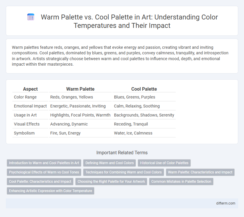
Table of Comparison
| Aspect | Warm Palette | Cool Palette |
|---|---|---|
| Color Range | Reds, Oranges, Yellows | Blues, Greens, Purples |
| Emotional Impact | Energetic, Passionate, Inviting | Calm, Relaxing, Soothing |
| Usage in Art | Highlights, Focal Points, Warmth | Backgrounds, Shadows, Serenity |
| Visual Effects | Advancing, Dynamic | Receding, Tranquil |
| Symbolism | Fire, Sun, Energy | Water, Ice, Calmness |
Introduction to Warm and Cool Palettes in Art
Warm palettes in art feature colors such as red, orange, and yellow that evoke energy, passion, and warmth, often used to create vibrant and dynamic compositions. Cool palettes include blues, greens, and purples, promoting calmness, tranquility, and depth, commonly applied to convey serene or somber moods. Understanding the psychological impact and color temperature helps artists effectively communicate emotion and atmosphere through their choice of warm or cool palettes.
Defining Warm and Cool Colors
Warm colors include hues such as red, orange, and yellow, which evoke energy, passion, and warmth by mimicking elements like fire and sunlight. Cool colors, comprising blue, green, and purple, generate calming, soothing effects reminiscent of water, sky, and foliage. Understanding these palettes helps artists create specific moods and emotional impacts through strategic color choices in their compositions.
Historical Use of Color Palettes
Historical use of warm and cool palettes in art reflects cultural symbolism and emotional impact, with warm palettes--featuring reds, oranges, and yellows--dominant in Renaissance and Baroque paintings to evoke warmth and vitality. Cool palettes, including blues, greens, and purples, were frequently employed in Impressionism and Modern art to create calmness and depth. Masters like Caravaggio utilized warm tones to highlight drama, while Monet's cool palette captured natural light and atmosphere, showcasing the evolving emotional narrative in art history.
Psychological Effects of Warm vs Cool Tones
Warm palettes, featuring reds, oranges, and yellows, evoke feelings of energy, excitement, and warmth, often stimulating creativity and passion in artistic compositions. Cool palettes, consisting of blues, greens, and purples, promote calmness, tranquility, and introspection, creating a soothing and contemplative atmosphere. The psychological effects of warm versus cool tones significantly influence viewer perception, mood, and emotional response, shaping the overall impact of artwork.
Techniques for Combining Warm and Cool Colors
Mastering the techniques for combining warm and cool colors involves balancing hues to create visual harmony and depth in artwork. Utilizing color overlays, gradients, and strategic placement enhances the contrast between warm reds, oranges, and yellows with cool blues, greens, and purples. Effective use of complementary color schemes and controlled saturation intensifies mood while guiding viewer focus across the composition.
Warm Palette: Characteristics and Impact
A warm palette in art primarily features colors such as red, orange, and yellow, evoking feelings of energy, passion, and warmth. These hues tend to advance in a composition, creating a sense of intimacy and drawing viewers' attention to focal points. Warm palettes are effective in conveying emotions like excitement and comfort, significantly influencing the mood and atmosphere of artwork.
Cool Palette: Characteristics and Impact
Cool palettes typically feature hues such as blues, greens, and purples, which evoke calmness, serenity, and introspection in artwork. These colors often create a sense of space and depth, making them ideal for backgrounds or tranquil scenes. Artists utilize cool palettes to convey moodiness or cool atmospheres, enhancing emotional resonance and visual contrast.
Choosing the Right Palette for Your Artwork
Selecting the right palette significantly impacts the mood and harmony of artwork, with warm palettes featuring reds, oranges, and yellows that evoke energy and passion. Cool palettes, comprising blues, greens, and purples, create calmness and tranquility, making them ideal for serene compositions. Understanding the emotional resonance and color relationships inherent in warm and cool hues ensures intentional and effective visual storytelling.
Common Mistakes in Palette Selection
Choosing a warm palette often leads to overuse of reds and oranges, causing a composition to feel overwhelming or aggressive. Selecting cool palettes can result in an overly muted and distant atmosphere if blues and greens dominate without contrast or warmth. Balancing saturation and hue ensures the palette supports the artwork's mood without creating unintended visual tension or emotional dissonance.
Enhancing Artistic Expression with Color Temperature
Warm palettes, consisting of reds, oranges, and yellows, evoke emotions of energy, passion, and warmth, intensifying the expressive quality of a composition. Cool palettes, featuring blues, greens, and purples, create a sense of calm, tranquility, and depth, enhancing mood and spatial perception in artwork. Mastery of color temperature enables artists to manipulate emotional responses and establish visual harmony or contrast effectively within their pieces.
Warm palette vs Cool palette Infographic