Warm colors such as red, orange, and yellow evoke feelings of energy, passion, and warmth, often making artwork feel vibrant and inviting. Cool colors like blue, green, and purple create a calming, serene atmosphere, providing a sense of tranquility and depth. Artists strategically use warm and cool colors to influence mood, highlight focal points, and balance compositions effectively.
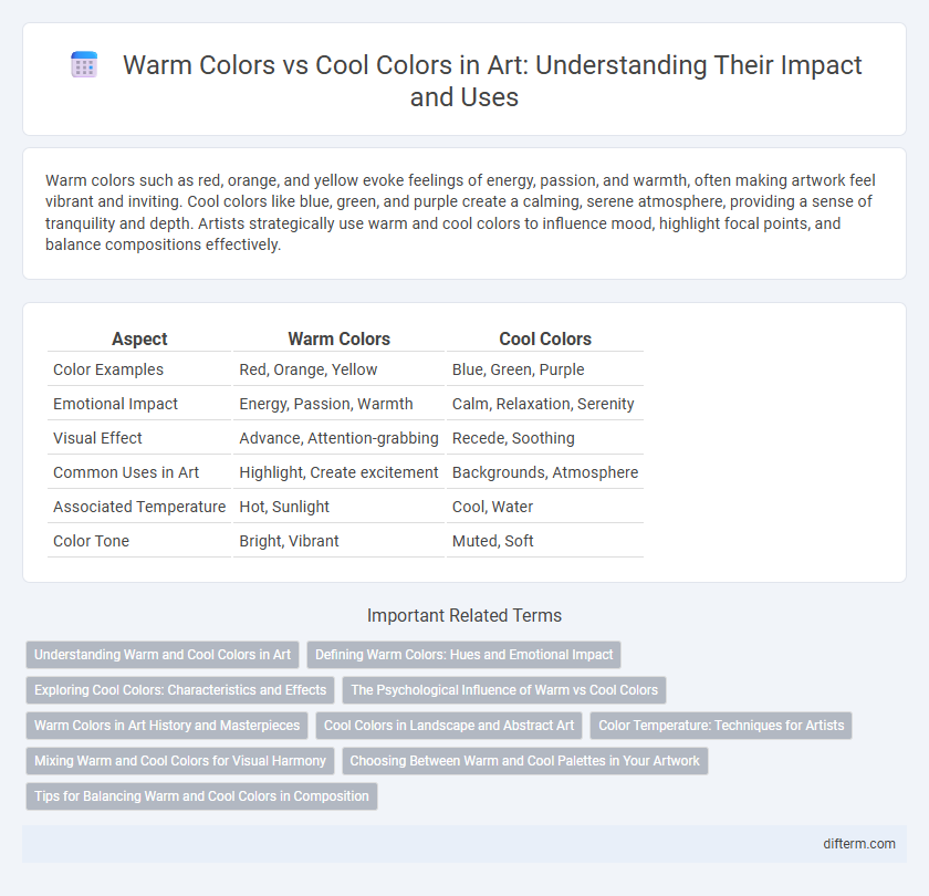
Table of Comparison
| Aspect | Warm Colors | Cool Colors |
|---|---|---|
| Color Examples | Red, Orange, Yellow | Blue, Green, Purple |
| Emotional Impact | Energy, Passion, Warmth | Calm, Relaxation, Serenity |
| Visual Effect | Advance, Attention-grabbing | Recede, Soothing |
| Common Uses in Art | Highlight, Create excitement | Backgrounds, Atmosphere |
| Associated Temperature | Hot, Sunlight | Cool, Water |
| Color Tone | Bright, Vibrant | Muted, Soft |
Understanding Warm and Cool Colors in Art
Warm colors such as red, orange, and yellow convey energy, passion, and warmth, often evoking emotions of excitement or comfort in artwork. Cool colors like blue, green, and purple create a calming, soothing atmosphere, commonly associated with tranquility and relaxation. Understanding the psychological impact and temperature perception of warm and cool colors enhances composition, mood setting, and visual balance in artistic creations.
Defining Warm Colors: Hues and Emotional Impact
Warm colors, including red, orange, and yellow, evoke feelings of energy, passion, and warmth, significantly impacting viewers' emotions and perceptions in art. These hues often dominate compositions to create a sense of excitement or intensity, making them essential for artists aiming to invoke strong emotional responses. The psychological effects of warm colors are linked to stimulation and comfort, enhancing visual storytelling through vibrant, dynamic palettes.
Exploring Cool Colors: Characteristics and Effects
Cool colors, including blues, greens, and purples, evoke calmness, tranquility, and serenity in artwork. These hues often create a sense of depth and distance, making compositions feel more expansive and soothing. Artists use cool colors strategically to balance warm tones, enhance mood, and convey themes of peace or introspection.
The Psychological Influence of Warm vs Cool Colors
Warm colors like red, orange, and yellow evoke feelings of energy, passion, and warmth, stimulating excitement and creativity in artistic compositions. Cool colors such as blue, green, and purple promote calmness, relaxation, and tranquility, often used to convey peace or introspection. Understanding the psychological influence of warm versus cool hues is crucial for artists aiming to evoke specific emotional responses and enhance the viewer's experience.
Warm Colors in Art History and Masterpieces
Warm colors, including red, orange, and yellow, historically evoke energy, passion, and emotion in art, prominently featured in masterpieces like Vincent van Gogh's "The Starry Night" and Henri Matisse's Fauvist paintings. These hues dominate works from the Renaissance to Expressionism, enhancing focal points and conveying warmth or intensity. Artists strategically employed warm colors to create depth, highlight subjects, and stimulate viewers' emotional responses, reinforcing their vital role in art history.
Cool Colors in Landscape and Abstract Art
Cool colors such as blues, greens, and purples evoke tranquility and depth in landscape and abstract art, creating a soothing visual experience. These hues are often used to represent water, sky, and shadowed areas in landscapes, enhancing atmospheric perspective and spatial distance. In abstract art, cool colors contribute to emotional calmness and can balance compositions by contrasting with warmer tones.
Color Temperature: Techniques for Artists
Warm colors like red, orange, and yellow evoke energy and passion, often used to create focal points and convey warmth in artwork. Cool colors such as blue, green, and violet produce a calming effect, enhancing depth and suggesting tranquility or distance. Artists employ color temperature contrasts to manipulate mood, spatial perception, and emotional impact within compositions, optimizing viewer engagement.
Mixing Warm and Cool Colors for Visual Harmony
Mixing warm colors like red, orange, and yellow with cool colors such as blue, green, and purple creates dynamic visual harmony by balancing contrast and unity in art compositions. Artists achieve depth and mood modulation by strategically blending warm hues' energy with cool tones' calming effects. Effective color harmony enhances viewer engagement and evokes balanced emotional responses through complementary temperature contrasts.
Choosing Between Warm and Cool Palettes in Your Artwork
Choosing between warm and cool color palettes in your artwork significantly impacts the emotional tone and visual depth of the piece. Warm colors like reds, oranges, and yellows evoke feelings of energy, passion, and warmth, making them ideal for dynamic, vibrant compositions. Cool colors such as blues, greens, and purples create a calming, serene atmosphere and add a sense of distance or tranquility, helping to balance or contrast intense warm hues.
Tips for Balancing Warm and Cool Colors in Composition
Balancing warm and cool colors in art composition enhances visual harmony and depth by using warm tones like reds, oranges, and yellows to attract attention and cool tones such as blues, greens, and purples to create calmness and contrast. Effective techniques include placing warm colors in focal points and using cool colors for background or shadow areas, ensuring neither overwhelms the other. Utilizing complementary color schemes and adjusting saturation and value can also balance the emotional impact and spatial perception of the artwork.
Warm colors vs Cool colors Infographic